National Gallery
Singapore
National Gallery Singapore is a leading visual arts institution that oversees the world’s largest public collection of Singapore and Southeast Asian modern art. Showcased below are some selected works during my employment.

Above HTML5 virtual exhibition developed during the Pandemic for Stories In Light: Four Modern Photographers in Singapore—offering audiences a chance to experience art in the comfort of their own home. The entire experience was developed together with agency MullenLowe. Copyright © National Gallery Singapore, 2021.

Above Minimalism: Space. Light. Object. exhibition tickets design. The show’s logo identity was designed by GOVT.

Above Olafur Eliasson. Room for one colour. 1997. Monofrequency lamps. Dimensions variable. © Olafur Eliasson. Installation view at Minimalism: Space. Light. Object., 2018. ©Image courtesy of National Gallery Singapore.

Above Light to Night festival happens yearly with immersive light installations across art institutions happening in the Civic District. Light to Night: Invisible Cities 2020 identity for NGS was art directed and conceptualized by me, with illustration and layout by Blaklabs.
The whole concept of this key visual aims to bring out the Day-to-Night activities in the Civic District. When viewed in totality, it shows a cluster of buildings with their reflection in the water. Upon closer look, it can be viewed from 2 perspectives—when seen upright, it showcases the night activity of the light show projections on buildings and when viewed upside down, the reflection of the “buildings” shows the daytime activities around the
Civic District area.
This key visual was eventually adapted across an extensive range of collaterals which included environmental branding, as well as assets for owned and paid media, etc…

Above Light projections on the facade of National Gallery Singapore. ©Image courtesy of National Gallery Singapore.

Above Floating City by Nipek and KNOTS ©Image courtesy of National Gallery Singapore.

Above Proposals for Novel Ways of Being initiative was launched by National Gallery Singapore and Singapore Art Museum as a collective response by the visual arts community to the global pandemic and its impact on our community. The umbrella branding of Proposals for Novel Ways of Being was inspired by the humble rubber band. The spirit of flexibility, adaptability, and its binding qualities are depicted metaphorically in the outcome of the design. This identity was meant to reflect the aspiration and most meaningful intention of the exhibition—which is to rally our community in bringing the arts back to local audiences whilst at the same time, signifying the collaborative spirit across all partners for this show. The identity was conceptualized by me and designed by Stephanie—a senior creative from SAM.

Above Different logo permutations give flexibility for the different art institutions to use and play with. Logo permutations designed by Stephanie.

Above Final key visual used to tie the whole show together across 12 institutions. Key visual designed
by Stephanie.

Above An Exercise of Meaning in a Glitch Season key visual was designed by me to represent the show at National Gallery Singapore. The whole concept tries
to communicate the glitches, especially in this strange period when we are all reeling from the Pandemic.
Above Time Passes key visual designed by Stephanie to represent the show at Singapore
Art Museum
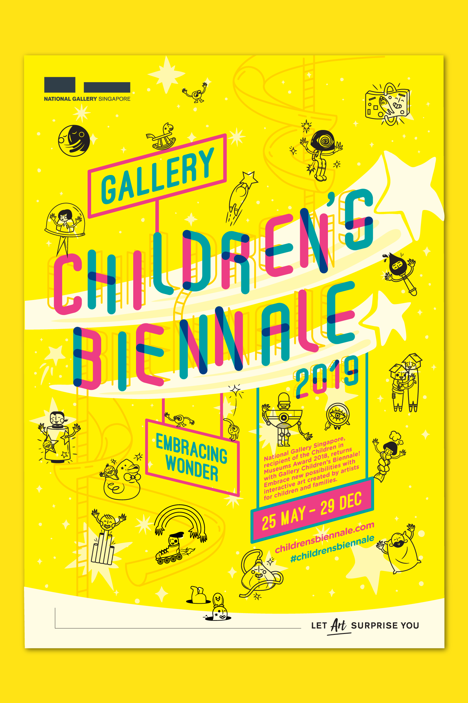
Above Children’s Biennale 2019 is the second edition of Gallery Children’s Biennale where kids and adults alike experience a new dimension of creativity and wondrous surprises through 11 imaginative artworks installations. The festival key visual was designed by GOVT and I was involved in adaptations across an extensive range of collaterals around the Gallery and through our paid and owned media.

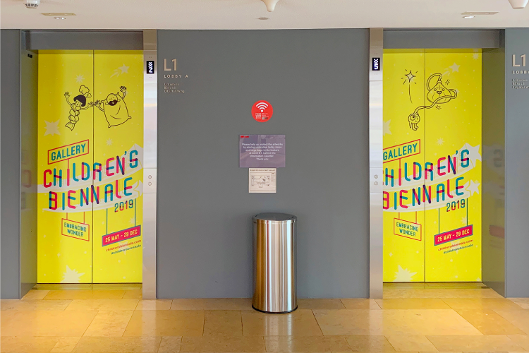

Above Environmental branding across spaces in the Gallery. The shooshing stars were incorporated as a pop-up to draw interest from the public. All images courtesy of Choo Chin Nian.